Touch areas

Accessibility is an essential aspect of software development, ensuring that digital products and interfaces are usable by individuals with disabilities. One critical element of accessibility is the touch area size of interactive elements such as buttons, links, and form controls. This documentation provides guidelines and recommendations for determining an appropriate target size to enhance accessibility for all users.

What is Touch Area Size?

The touch area size refers to the area or region that a user needs to interact with in order to activate or control an element on a digital interface. It is measured in terms of width and height and is typically associated with interactive elements such as buttons, links, checkboxes, radio buttons, and form inputs.

Importance of Touch Area Accessibility

Designing and implementing appropriate target sizes is crucial for accessibility for several reasons:

Motor Impairments: Users with motor impairments, including mobility issues or dexterity limitations, may have difficulty accurately targeting small elements. A larger touch area size makes it easier for them to interact with 
the interface effectively.

Touch Devices: With the rise of touch-based devices like smartphones and tablets, users interact with digital interfaces using their fingers. A larger touch area size compensates for the imprecise nature of touch input, reducing the chance of accidental taps or selections.

Aging Population: As people age, they may experience a decline in motor skills and visual acuity. Providing larger touch area sizes improves usability and accessibility for older users.

Blind users: Enlarging touch areas helps minimize error rates for blind users. With more substantial touch targets, blind users are less likely to tap adjacent elements accidentally, leading to fewer errors and frustration during app usage. In summary, touch area accessibility plays a critical role in facilitating the seamless interaction and navigation of mobile devices for blind users.

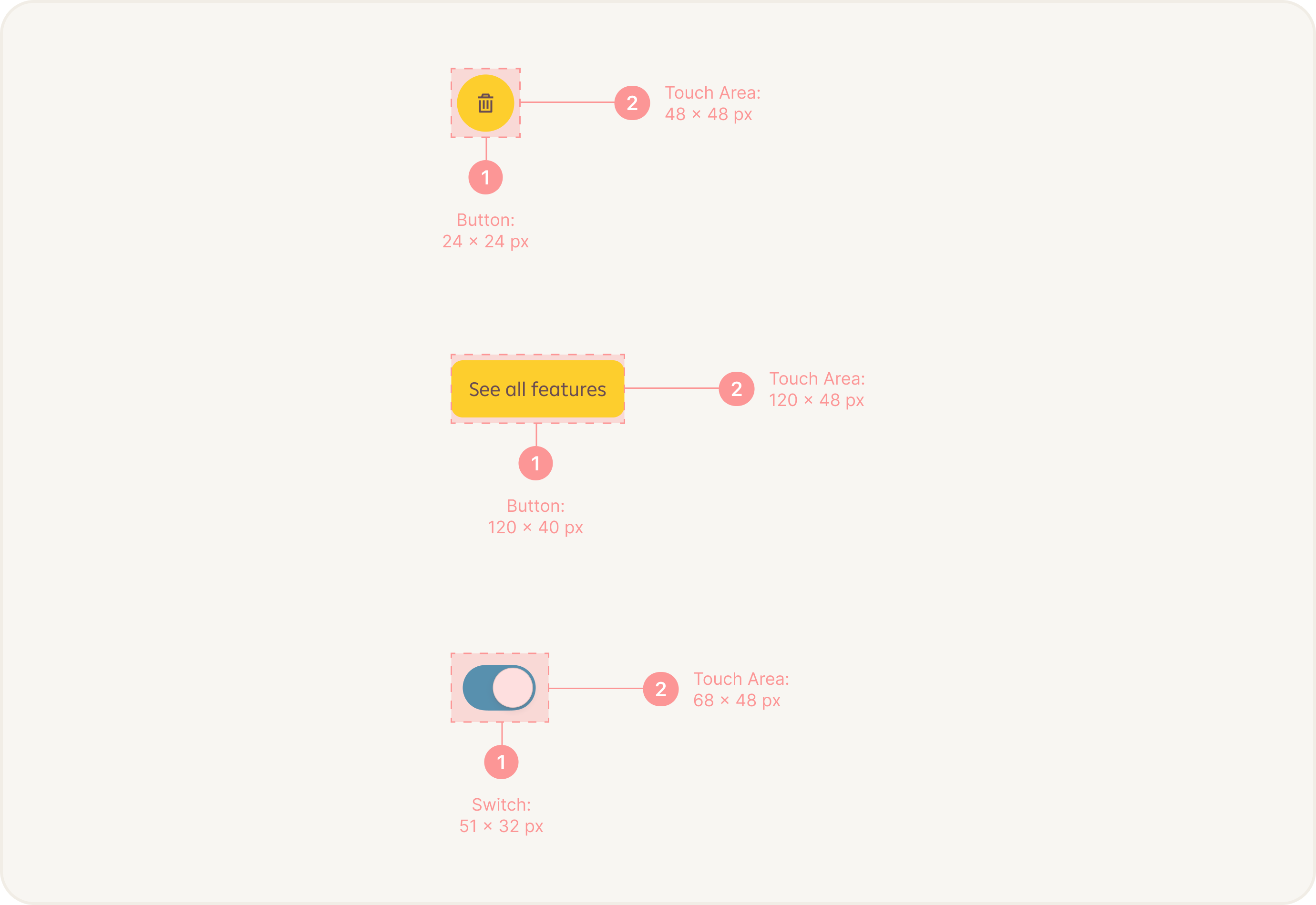
Recommended Touch Area Size

While the optimal target size depends on various factors, including the intended device, user population, and context of use, the Web Content Accessibility Guidelines (WCAG) 2.1 provides a minimum recommendation for target sizes. Interactive elements should have a target size of at least 44 pixels by 44 pixels (or 44x44 CSS pixels). This size ensures that the touch area is large enough to be easily activated by most users, including those with motor impairments or using touch-based devices.

We recommend using minimum touch area size: 48 x 48 px.

Implementing Touch Area Size Accessibility

Here are some practical considerations to implement target size accessibility effectively:

Visual Design: Use visual cues like borders, color contrast, and hover effects to indicate interactive elements and provide clear affordance.

Touch Area Size: On touch-based devices, ensure the target size accounts for finger size. Larger target sizes may 
be necessary for touch interfaces to accommodate the imprecision of touch input.

Keyboard Accessibility: Ensure that all interactive elements can be easily accessed and activated using keyboard navigation alone. This includes providing visible focus indicators and ensuring a logical tab order.

Testing: Regularly test the touch area sizes using real devices, simulators, or accessibility testing tools. Evaluate their usability and gather feedback from users with disabilities to identify areas for improvement.

Conclusion

Considering accessibility target size is essential to make digital interfaces inclusive and usable for all users. By adhering to the recommended guidelines and implementing appropriate target sizes, you can ensure that your software or website accommodates users with diverse needs and provides an accessible user experience. Remember to test your implementation and gather feedback to continuously improve accessibility.