Special dyslexia fonts
Dyslexia fonts are designed to assist individuals with dyslexia in improving their reading experience, but their effectiveness can vary from person to person. While there is anecdotal evidence supporting the benefits of dyslexia fonts, scientific research on their efficacy is limited and inconclusive. The underlying idea behind dyslexia fonts is to make reading more accessible by addressing common challenges faced by dyslexic individuals, such as letter and word confusion, visual stress, and difficulty with letter recognition. These fonts incorporate specific design elements, such as unique letter shapes, increased spacing, and consistent baselines, to enhance readability and reduce visual disturbances.
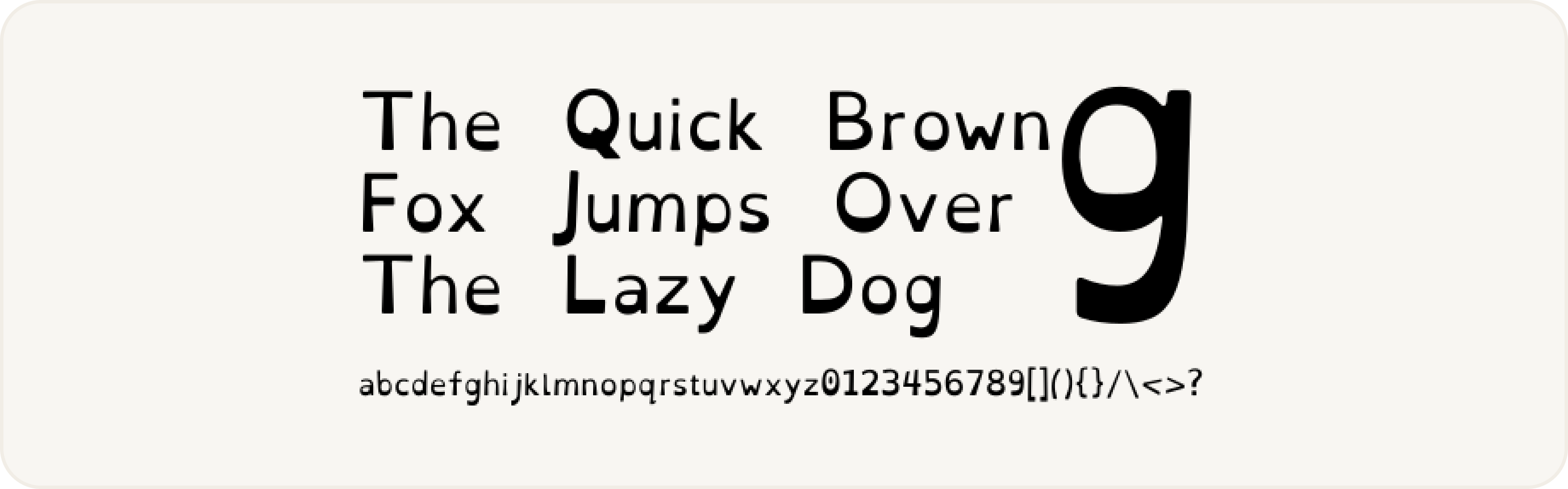
OpenDyslexic
OpenDyslexic free font features heavier lines that are meant to increase readability for readers with dyslexia — but rigorous research suggests that other mainstream fonts may be more effective. Font: https://opendyslexic.org
Do Dyslexia Fonts Actually Work?
Supporters of dyslexia fonts argue that these design modifications can positively impact reading accuracy, speed, and comprehension for some dyslexic readers. They believe that by providing clearer visual cues and reducing the likelihood of letter reversals or rotations, dyslexia fonts can help dyslexic individuals overcome some of the barriers they face while reading.
However, the effectiveness of dyslexia fonts is a subject of ongoing debate within the scientific community. Some studies have suggested that dyslexia fonts may offer certain benefits, such as increased reading speed or reduced reading errors, for specific subsets of dyslexic individuals. However, other studies have failed to find consistent improvements or have shown that individual preferences play a significant role in determining font effectiveness.
It's important to recognize that dyslexia is a complex learning disorder that affects individuals differently. What works for one person with dyslexia may not work for another. Dyslexia fonts should be considered as one of many potential tools and accommodations to support individuals with dyslexia, alongside other strategies such as multi-sensory instruction, assistive technology, and personalized reading interventions.
How To Design
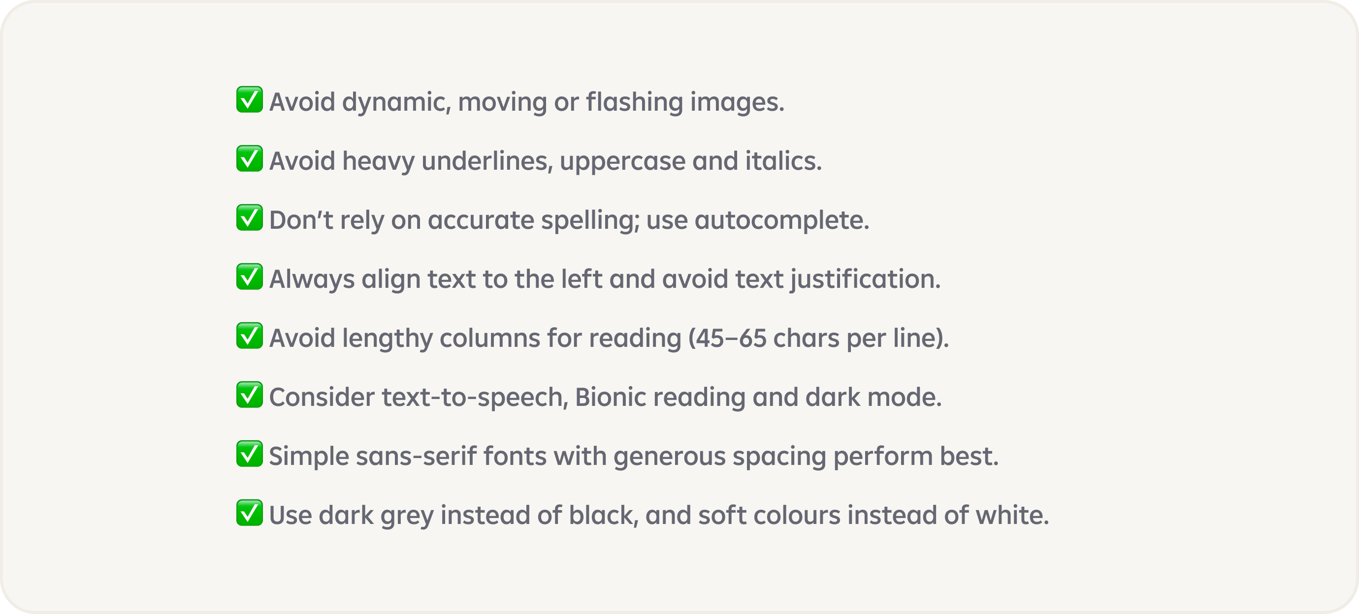
How To Design For Users With Dyslexia. Almost 10% of all of us have some sort of dyslexia, but too often it’s not a part of design conversations:
- For dyslexic users, reading can take up to 3× as long.
- Users often confuse and swap b, p, d and n, u and m, w.Remembering words between screens is difficult.
- Heavily distracted by flashing images or sounds.
- Difficulty to read analog clocks, time, directions, numbers.
Scientific Study From 2017
Study 1 — Dyslexie font does not benefit reading in children with or without dyslexia (Published: 04 December 2017)
In a separate 2017 study, researchers compared another popular dyslexia font — Dyslexie, which charges a fee for usage — with Arial and Times New Roman and found no benefit to reading accuracy and speed. As with the previous dyslexia font, children expressed a preference for the mainstream fonts. “All in all, the font Dyslexie, developed to facilitate the reading of dyslexic people, does not have the desired effect,” the researchers concluded. “Children with dyslexia do not read better when text is printed in the font Dyslexie than when text is printed in Arial or Times New Roman.”
“I don’t necessarily think teachers need to go and get a special font,” says Julie Rawe, a member of W3C’s Cognitive and Learning Disabilities Task Force and a reading and disability expert at Understood. “So far, the research doesn’t really have a lot of evidence showing that these special fonts help kids or adults with dyslexia to read faster or make fewer mistakes.”
Scientific Study From 2016
Study 2 — The effect of a specialized dyslexia font, OpenDyslexic, on reading rate and accuracy (Published: 18 March 2016)
Under close scrutiny, the evidence for dyslexia-friendly fonts falls apart. In a 2016 study, for example, researchers tested whether OpenDyslexic, a popular font with thicker lines near the bottom of the letters, could improve the reading rate and accuracy for young children with dyslexia. According to the developers of the font, which is open-source and free of charge, the “heaviness” of the letters prevented them from turning upside down for readers with dyslexia, which they claimed would improve reading accuracy and speed.
Researchers put the font to the test, comparing it with two other popular fonts designed for legibility — Arial and Times New Roman — and discovered that the purportedly dyslexia-friendly font actually reduced reading speed and accuracy.
In addition, none of the students preferred to read material in OpenDyslexic, a surprising rebuke for a font specifically designed for the task.
Scientific Study From 2010
Study 3 — Uncoupling of reading and IQ over time: empirical evidence for a definition of dyslexia (Published: 21 January 2010)
Dyslexia fonts may also give students false hope — and result in disappointment, the researchers of the study warn. The most harm may come when students who have already experienced significant struggle and academic failures related to learning to read have yet another experience with failure when they are not able to read significantly better in a font designed to do so.
That’s because children with dyslexia often have to deal with the stigma of being behind their peers, and they may conclude that they’re not smart enough to master the materials, according to a 2010 study. If a child is told that a dyslexia font can help them read, but it doesn’t actually improve their grades or their reading experience, they may assume that the problem lies with their own inability — not with the font.
Conclusion
Ultimately, the use of dyslexia fonts is a personal choice, and it is essential to consider individual preferences and needs. Some dyslexic individuals may find dyslexia fonts helpful and prefer using them, while others may not see a significant difference. It is crucial to provide a range of support options and consider a multi-faceted approach when assisting individuals with dyslexia in their reading journey.
On scores of reading speed and accuracy, dyslexia fonts perform no better than common fonts like Arial and Times New Roman, and sometimes they perform worse, according to recent studies. Even using dyslexia fonts with neutral effects can raise false hopes in struggling young readers, contributing to feelings of helplessness and discouragement.
Based on the above facts and scientific studies, we do not recommend replacing our current Amalia font with special fonts.
Links:
https://www.edutopia.org/article/do-dyslexia-fonts-actually-work/