Alternative text
Alternative text is announced by screen readers and describes the purpose, function, or content of an component or image.

Recommendations
Tip #1
If there are buttons and each has an icon and a label then the screen reader should NOT announce anything for the icons. Otherwise it would be annoying to have twice the same information.
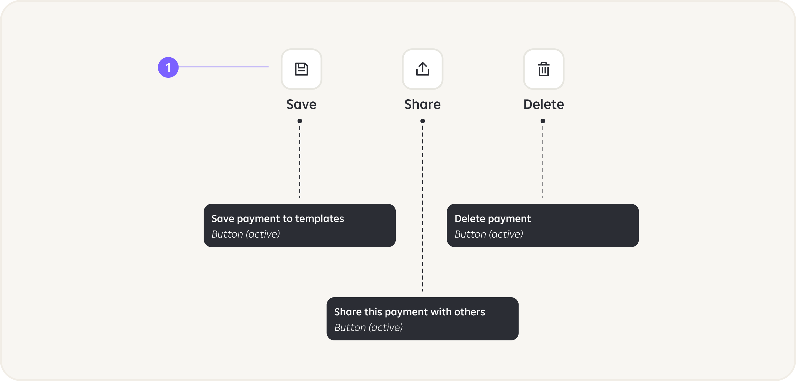
Tip #2
Add more descriptive texts for actions, e.g:
Share -> Share this payment detail with othersContinue -> Continue to payment summary.

Tip #3
Each element on the screen should have a name/description.
Tip #4
Each action/tappable element should have option for the action to be performed.
Tip #5
Balance and all important numbers should be read as one number, not separately as digits.

Tip #6
Images that do not convey meaning, or are non-functional and beside text that conveys their meaning are considered decorative. Such images should be marked as ”decorative” and be skipped by voice over.

Tip #7
Images that convey meaning are informative and require alt text.
Tip #8
We do not recommend usage of texts inside images.

Tip #9
Such text/input fields should have alt text like: ”Enter amount”.

Tip #10
”Minus” or ”plus” should be as a first information to inform if it is outgoing or incoming transaction.
Tip #11
Time stamps should be used as Headings in order to be able to navigate with date.

Examples
If PIN is entered via keyboard, make sure that the texts of the numbers are not hidden, otherwise user will not be able to get in.

RECOMMENDATION:
Do not use date entering with numeric keyboard use date picker.

Localisation keys can be used and injected for the annotation component.

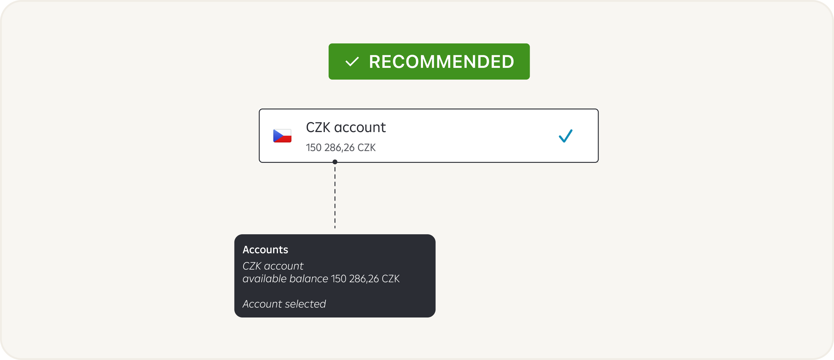
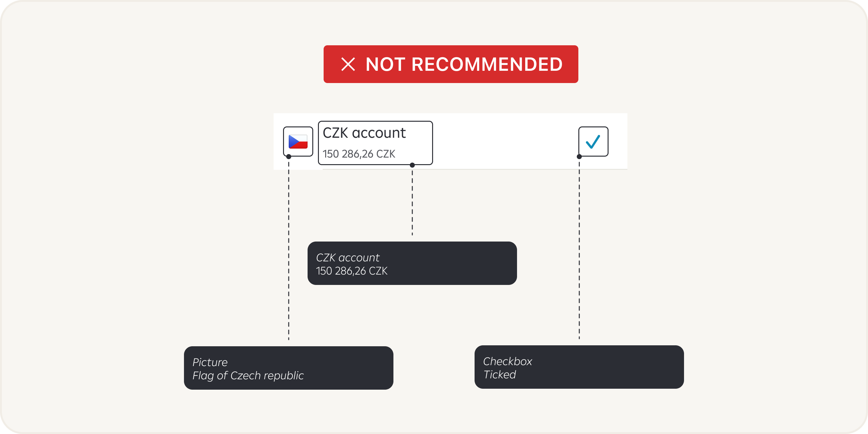
In case the user has to choose one option from the list, we recommend making the entire List Cell selectable, not just the Checkbox.