Font sizes
Font size accessibility is essential in mobile phone apps documentation to ensure that the content is readable and accessible to a wide range of users, including those with visual impairments or low vision.
Alternate Layouts
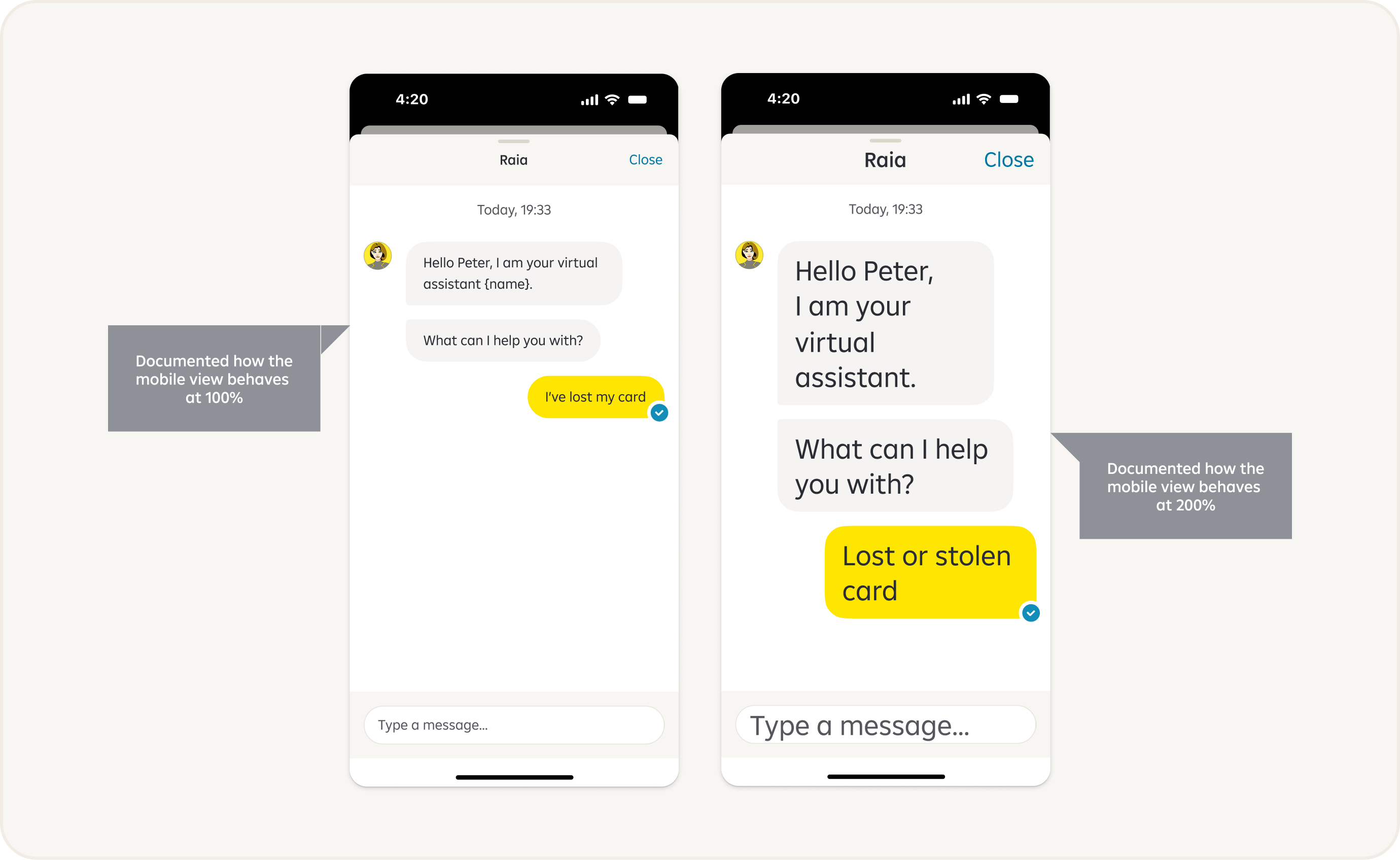
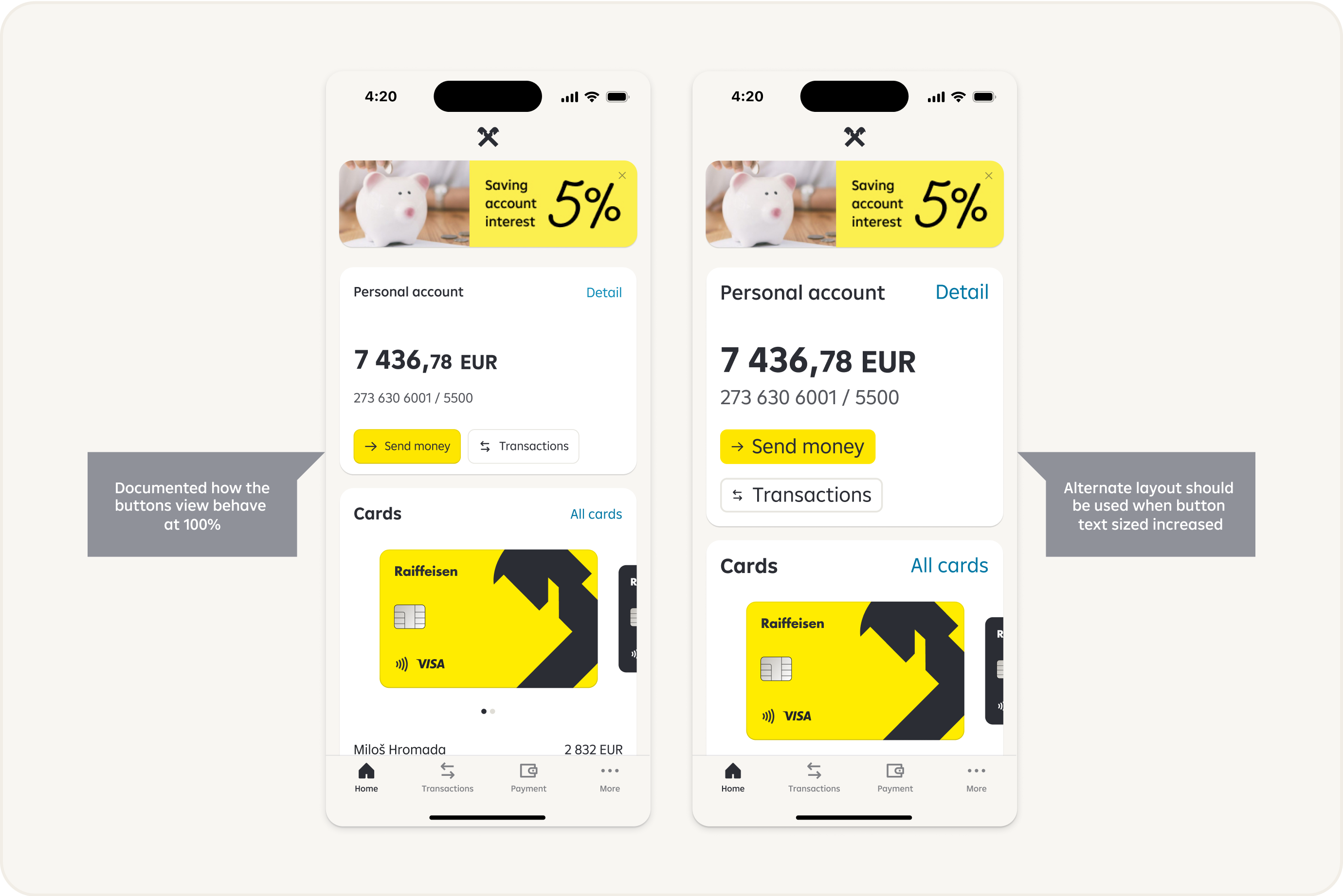
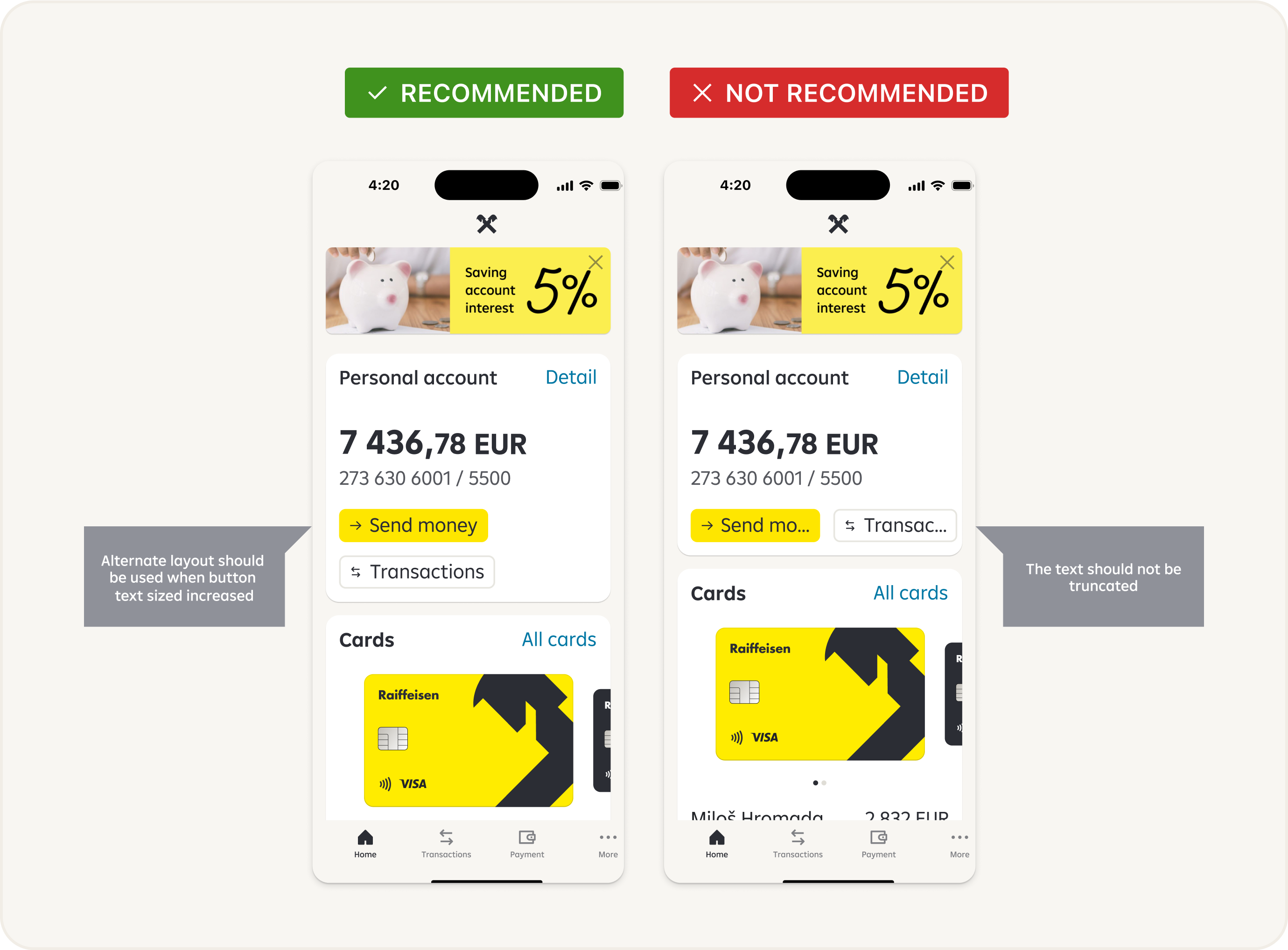
Ensuring accessibility in font sizes for alternate layouts is crucial to make content, buttons, etc. readable and usable for individuals with varying visual abilities.
Truncation
Truncating text can lead to the loss of important information and context, which can negatively impact communication and understanding.
It's generally better to design systems or interfaces that can handle longer texts without truncation. This allows users to access the complete information and minimizes the risk of miscommunication or misunderstanding.
We do not recommend text truncating.
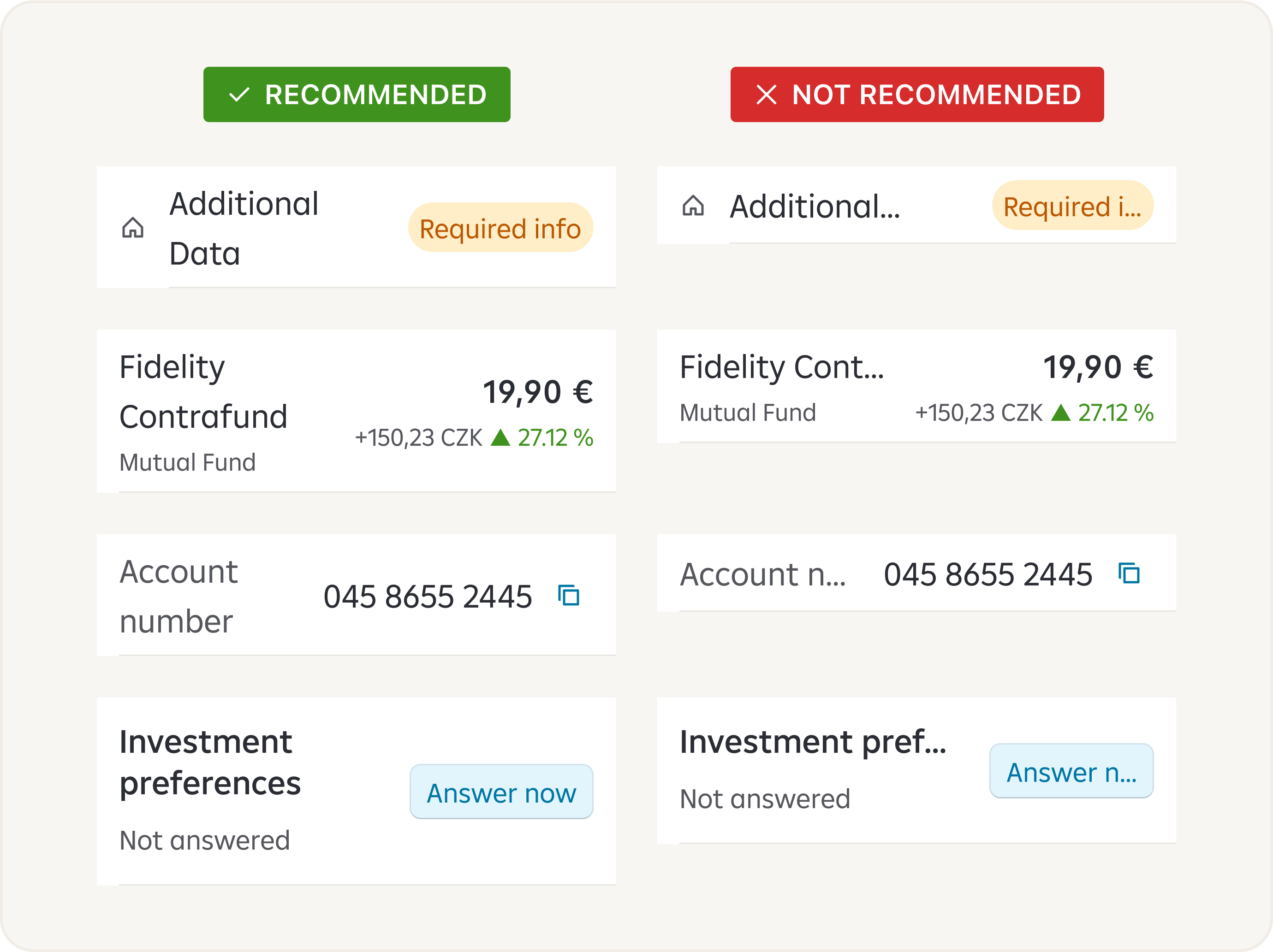
Truncating buttons can lead to the loss of important information and context, which can negatively impact communication and understanding.
We do not recommend buttons truncating.
Recommendations
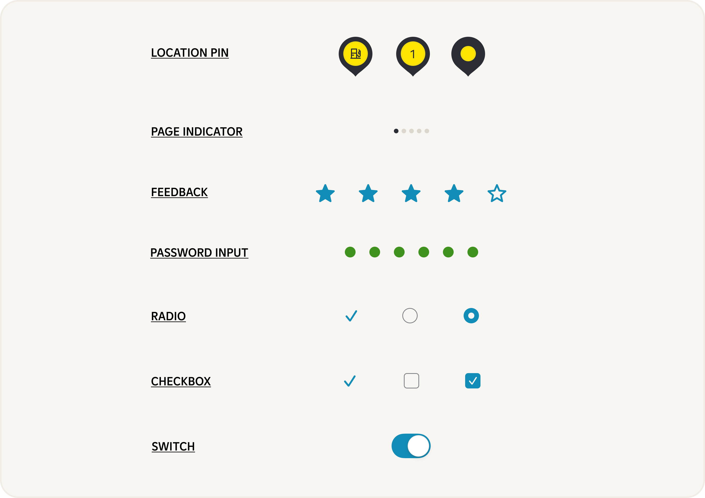
Components where we do not recommend use big fonts:

Components where we do not recommend use big fonts:

Components where we do not recommend use big fonts:
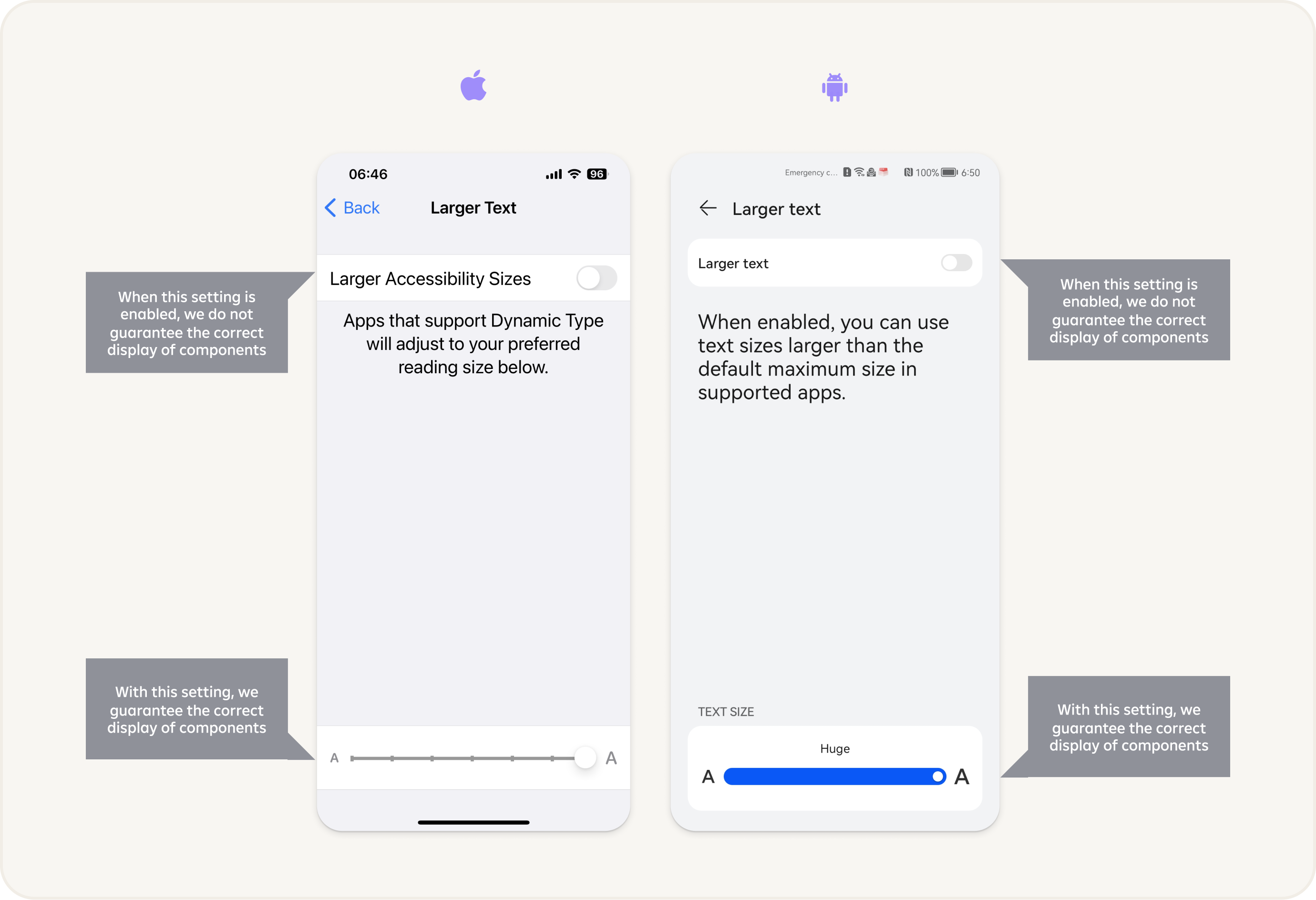
Settings
Accessibility settings for font sizes can typically be found in the display or accessibility section of a device's settings menu. The exact location and terminology may vary depending on the operating system or device you are using.