Introduction
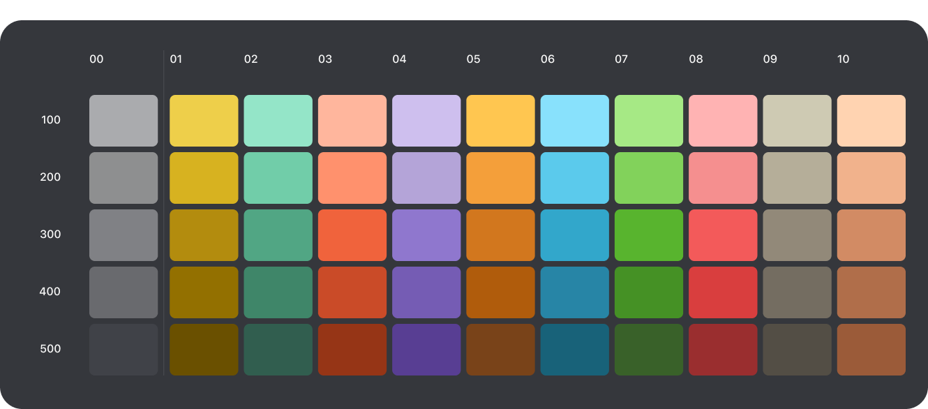
The unified color system helps you apply color to your UI in a meaningful way. There is a need to be intentional and functional with color use. Although the unified color system has a bit of overlap with the Raiffeisen brand, there are also many other colors not found in the Raiffeisen brand.

Greyscale colors
Black, white and everything in between. The greyscale is a key palette used as background & foreground color or text in your UI. It is most commonly applied on elements such as containers, headers, sections & boxes. We refer to these as surface colors. Additionally you often use greyscale colors to different forms of text in your interface such as headings, titles & paragraphs. You’ll be able to find the usage for these in the “Tint colors” section.

Primary colors
Intent colors are reserved for user interface design. We use system colors to call attention to specific UI elements. Each system color is mapped to what we call a visual intent that conveys the status of UI element.

Secondary colors
Intent colors are reserved for user interface design. We use system colors to call attention to specific UI elements. Each system color is mapped to what we call a visual intent that conveys the status of UI element.

Meaning colors
Intent colors are reserved for user interface design. We use system colors to call attention to specific UI elements. Each system color is mapped to what we call a visual intent that conveys the status of UI element.

Chart colors
Intent colors are reserved for user interface design. We use system colors to call attention to specific UI elements. Each system color is mapped to what we call a visual intent that conveys the status of UI element.

Infographic colors